

HERC Education Center website is based on four main technologies: Bootstrap, Html, CSS and JavaScript. Each of these technologies plays a different role in creating a responsive, attractive and functional web page.

Bootstrap is a popular front-end framework that provides a set of ready-made components, such as buttons, navbars, cards, forms and more. Bootstrap also offers a grid system that allows for easy layout of the web page elements across different screen sizes and devices. Bootstrap is built with html, CSS and JavaScript, but it simplifies the development process by applying consistent styles and behaviors to the components.
Html stands for Hyper Text Markup Language and it is the standard language for creating web pages. Html defines the structure and content of the web page using tags and attributes. Html elements can be nested inside each other to create complex layouts and semantic meaning. Html also allows for linking to other web pages or resources using hyperlinks.
CSS stands for Cascading Style Sheets and it is a language that describes how html elements should be displayed on the web page. CSS can control aspects such as color, font, size, position, margin, padding, border and more. CSS can also create animations and transitions using keyframes and properties. CSS can be written in separate files or embedded in html tags using the style attribute.
JavaScript is a scripting language that enables dynamic and interactive features on the web page. JavaScript can manipulate html elements and CSS styles using the Document Object Model (DOM) API. JavaScript can also respond to user events, such as clicks, scrolls, inputs and more. JavaScript can also communicate with external servers or APIs using XMLHttpRequest or Fetch objects.
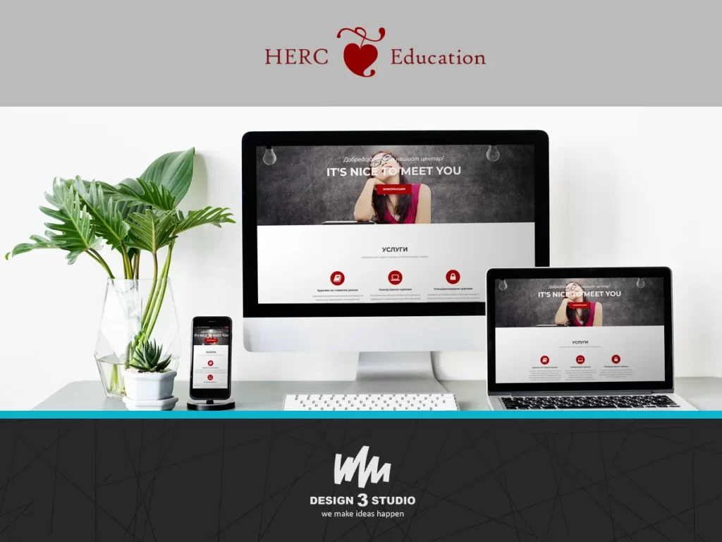
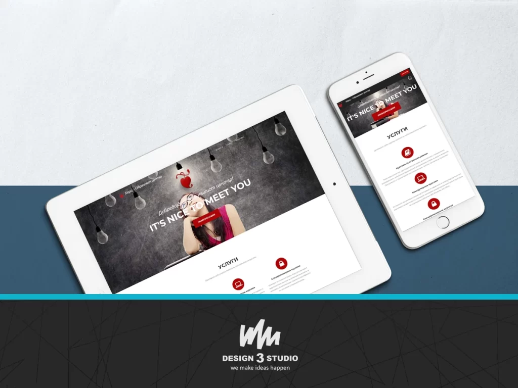
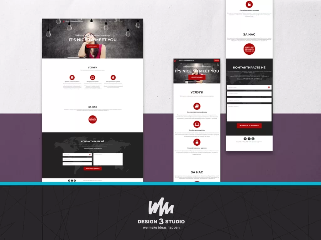
The UI/UX design of this website has a clear and intuitive navigation system that guides the user through the different sections. The website uses a consistent and harmonious color scheme that creates a pleasant visual experience. The website also employs contrast, alignment, hierarchy and whitespace to enhance readability and usability. The website adapts to different screen sizes and devices using Bootstrap’s responsive grid system and media queries.
This is a good example for a one-page website that is done without using CMS and any type of database, but uses modern technologies for a great final result.